Now Track Mobile Usability In Webmaster Tools

The Mobile is growing at a fantastic pace. Not just in screen size and technical specs, but in usage as well. For some businesses, the mantra these days is 'Go mobile, or go home'. If you're a webmaster, you know all too well the struggles of maintaining a mobile site. So to keep you informed of issues mobile users might be seeing across your site, our good friend, Google Webmaster Tools, has now added a new Mobile Usability Feature.
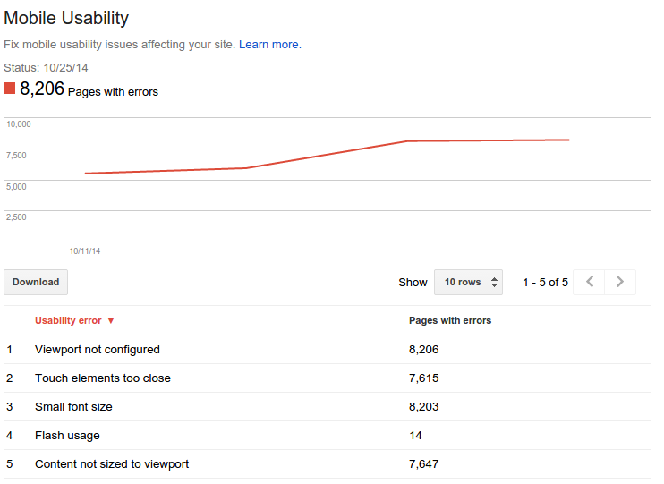
The new feature shows mobile usability issues Google identifies across your website, complete with graphs over time so that you see the progress that you've made.
Understanding mobile usability
A mobile-friendly site is one that you can easily read & use on a smartphone, by only having to scroll up or down. Swiping left/right to search for content, zooming to read text and use UI elements, or not being able to see the content at all make a site harder to use for users on mobile phones.
To help, the Mobile Usability reports show the following issues:
- Flash content
- Missing viewport (a critical meta-tag for mobile pages)
- Tiny fonts
- Fixed-width viewports
- Content not sized to viewport
- Clickable links/buttons too close to each other.

This is an invaluable feature that can help webmasters diagnose problems that mobile users face on their website. It is strongly recommend that you take a look at these issues in Webmaster Tools, and think about how they might be resolved; sometimes it's just a matter of tweaking your site's template!
If you have any questions, feel free to ask us in the comments section below. Cheers :)

Comments
Post a Comment